If you are searching for a way to boost your business, landing pages are the answer. At their most basic level, landing pages are web pages that help drive visitors toward a single goal.
Landing pages come in all shapes and sizes and can be used to promote anything from products and services to events or causes. Regardless of your landing page type, they all have one thing in common: They make things easier for you!
Importance of Landing Pages for Google Ads
Landing pages are an important part of your PPC strategy, and they can be used to increase your conversion rates.
People tend not to click on search results that don’t match their intent or expectations. They often bounce back from websites because there isn’t enough information available. But landing pages help you target specific audiences and ensure they convert by having the appropriate information in place, giving users what they want right away, and making it easy for them to complete the action you want them to take (like buying a product).
Landing pages are also more likely to convert than other types of advertising because they’re built specifically for this purpose: getting people who’ve shown a direct interest in what you offer through Google Ads into contact with another piece of marketing material—a form, email newsletter signup button, etc.—that would lead them eventually down the path toward becoming customers; thus increasing sales per customer acquisition cost while reducing overall costs per customer acquired by not using other forms of advertising such as banner ads or social media posts instead.
Set up a Winning Landing Page for Your B2B Google Ads Campaigns
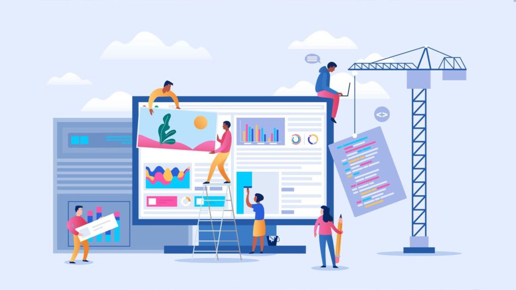
Landing pages are an essential part of any Google Ads campaign, and if you don’t have a winning landing page, it can be detrimental to your online marketing efforts.
Landing pages play a key role in bringing visitors in front of your sales funnel. Oftentimes, companies make the mistake of not investing enough time or money into building effective landing pages for their ad campaigns. The truth is that creating a good landing page from scratch takes time, but thankfully, many tools allow you to create great-looking landing pages quickly and easily!
Whether you’re just starting with Google Ads or have been using them for many years now, it doesn’t matter because everyone needs help when they first start – even the top advertisers use tools like Unbounce (which we will talk about later) when building their ads campaigns. After all, the right tools make all the difference when driving traffic toward these types of websites!
1. Create a Highly Visible Call to Action

While the headline is the most important landing page element, it’s not the only one. You’ll also want to consider what you are going to put in your “body” section and how it can help support your message.
Make sure that your call-to-action (CTA) is visible.
Your CTA gets people moving from just looking at your landing page to taking action on something you’ve asked them to do. A good rule of thumb is that 50% of visitors won’t scroll below the fold; if they don’t see your CTA, they might not even read any further than that point! Make sure that this crucial part of your page stands out visually, so it’s impossible for prospective customers not to notice it and know exactly what they need to do next—whether filling out a form or clicking through on one of many links on that page.”
2. Provide Personally Relevant Content

If you are using Google Ads to drive traffic to landing pages, there are a few steps you can take to ensure that your visitors get a personalized experience.
First, personalize your messaging based on the data you have about the customer. This means having different offers and CTAs for each visitor who comes from an ad:
- If someone comes from an ad with a certain keyword, send them to a page for that product or service.
- If someone is already familiar with your brand or products/services (e.g., they’ve visited your website before), then provide them with more information about the benefits of working with you and encourage them to sign up for newsletters or webinars. The goal here is not just lead generation; it’s also about building trust so that when they’re ready to make their first purchase decision later down the line, they’ll stick with what familiar company name they saw in those ads months earlier!
Second, personalize your landing page. If you’re using Google Ads to drive traffic to a website where visitors can browse products/services or sign up for newsletters/webinars, then make sure that each visitor gets an experience tailored specifically to them by using dynamic text on your pages (e.g., “Hi [name], thank you for signing up for the email list!”). You can also provide information about what they’ve been reading about and how many times they’ve visited the site before (or if this is their first visit), which will help build trust with customers who are already familiar with your brand or products/services.
3. Promote a Product or Service Benefit

A landing page is designed to get people to take action, such as making a product purchase or filling out a form. In order to drive more traffic from your ads, you must promote relevant product or service benefits on those landing pages. You can also offer compelling reasons for potential customers to buy now rather than later (e.g., discounts).
You can use several landing pages to promote your products and services: -Product page: Use this type of page to show the product in detail and provide information about how it works. It’s also a good idea to include videos that explain how your product is used or show its benefits. You can include customer reviews on these pages as well.
Call-to-action (CTA) page: A CTA page is designed to get people who visit it to take action, such as signing up for your email list or making a purchase. For example, if you sell products online and want people searching for your products on Google Search to visit your website, you can create a Google Ads campaign to drive traffic to your landing pages.
4. Keep Your Form Simple, Yet Effective
When designing your landing page, it’s important to keep the form simple. Don’t make it too long or ask for more than is needed. A good rule of thumb is to only ask for the necessary information to complete your ad campaign’s objective. If someone fills out a form on your landing page and doesn’t complete all the required fields, Google Ads will prompt them with an error message: “Please complete all required fields before submitting this form.” This can discourage visitors from completing their goal — defeating the purpose of landing a landing page in the first place!
Make sure your forms are easy to fill out by making sure they aren’t too complicated or difficult to understand. This will help ensure people follow through with what they came to do on your website instead of abandoning ship when faced with a complex form (or multiple ones).
The best way to ensure that your forms are easy to fill out is by asking for only what you need. If you have a goal, such as getting someone’s email address, don’t ask for anything else. Even if they give you an email address, there’s no guarantee that it will be valid or even real (and therefore useless).
5. Offer a Compelling Guarantee

A guarantee can help you increase conversions and sales. When potential customers see your landing page, they’ll think, “is this company credible?” “Can I trust them?”
In order to build trust with your audience, an offer of a compelling guarantee is one way to do it. For example, if an e-commerce store promises that if the customer isn’t satisfied with their purchase, they can return it within 30 days, buyers will feel more at ease purchasing from them because they have peace of mind knowing that they won’t be stuck with something that doesn’t fit or isn’t what they expected.
Another way to build trust is by showing your customers that you’re an industry leader. For example, suppose you are selling a product typically at a higher price point but offering it for less than the competition. In that case, buyers will be impressed by your value proposition and more likely to purchase from you.
6. Create a Sense of Urgency

- Use a countdown timer. You can use a countdown timer to create urgency, but ensuring that your landing page has enough information for the user to act on quickly is important. If you have too many steps or if the process is confusing, that could lead to people abandoning their shopping cart before they buy anything.
- Offer a limited-time offer. Another way to build urgency into your landing pages is by offering a limited time frame, such as an exclusive discount code or special offer that expires midnight on Sunday night (or whatever day works best for your business). Seeing their opportunity ticking away in front of their eyes may motivate them into action and drive them towards purchasing something from you before time runs out!
- Use social proof. Social proof is one of the most powerful ways to build urgency into your landing page because it shows people what others have done in the past and gives them a reason to follow suit. This could mean showing off customer testimonials, reviews from industry experts, or even data about how many people have already purchased the product that you’re selling.
All these things can help you create a sense of urgency and make people feel like they have to act now if they want to get their hands on the same thing that other people have already purchased.
7. Create Primer Landing Pages

Primer landing pages are a great way to capture leads. A primer landing page is used to collect information from people who are not ready to buy. Primer lead generation pages can be used to collect email addresses, phone numbers, and other information that will help you understand what your target audience wants and how they want it delivered.
If you are new to B2B lead generation, primer landing pages are a great place to start. This type of page is designed specifically for customers who aren’t ready or able to make a purchase immediately—they may need more information before buying anything from you or your company.
A primer landing page is a great way to capture leads and build your list. This type of page is designed specifically for customers who aren’t ready or able to make a purchase immediately—they may need more information before buying anything from you or your company.
8. Create New Lead Capture Forms On Your Landing Pages

You can also create a new form on your landing page specific to your business, including all the necessary fields. This will help users enter all the information they need and save you time in collecting it. The more detailed and comprehensive the form is, the better it will work.
Creating a form that is easy to fill out is also important. If you have too many fields or confusing ones, it will be more difficult for your users to fill them out. You should also include a field that asks for their email address so you can send them updates about your business.
9. Create Google Ads-Specific Landing Page
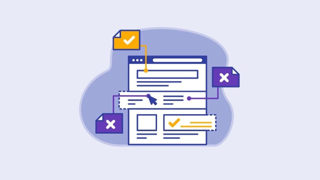
Landing pages are the most important component of your Google Ads (formerly AdWords) campaigns. While they aren’t always the most exciting part of SEO, they are crucial to improving click-through and conversion rates.
A landing page is a page on your website that visitors land on when they click on your product ad or follow a link. In order to create great landing pages, you need to know what keywords you want people who see your ads to be searching for so that you can create specific landing pages targeted at those terms.
For example, suppose someone sees an ad for [Company Name] software and clicks on it because they have been struggling with their project management tool and want recommendations from other users. In that case, their query is likely related to “project management software” or something similar but quite specific (maybe even just “Project Management Software Review”). You would want a separate page that covers this topic specifically rather than trying to cover everything about [Company Name] software on one massive page under its homepage banner or product category listings.
10. Landing Pages Have Higher Conversion Rates When They Include Relevant Images

Images can be used to convey a message or sell a product. Images can also be used to illustrate a product or service and show its benefits, features, and advantages in an easy-to-understand manner.
As you design your landing page, consider incorporating images that will help you achieve the following:
- Help visitors understand all they need to know about the product or service being offered on your website
- Make them want to buy it
- Help them understand the benefits of using your product or service
- Help them understand the features and advantages of your product or service. Help them see how they can benefit from using it.
- Help them understand the value of what you’re offering. Help them see how your product or service can make their life easier, better, more productive, etc.
11. Remove Navigation Links from Your Landing Pages
A good landing page should keep the user focused on the task.
You need to remove navigation links from your landing pages to do this. If you’re using ad extensions, don’t include those, either.
You should also avoid including any links in the header and footer of your page because that takes up valuable real estate on your screen—real estate that could be used to convert more users or increase engagement with your campaign message.
Some marketers also recommend removing all social media buttons from your landing pages. This is because users will be more likely to share your content if they are already engaged.
If you’re running an email campaign, keep the subject line short. The best email campaigns are concise and to the point. Don’t use a long subject line—it will get cut off when it reaches users’ inboxes.
You are Responsible for Setting the Right Expectations
You’re responsible for setting the right expectations. Your landing page should be clear and concise so that visitors know exactly what they can expect when they click on your ad.
Set expectations by using clear language:
- Use a specific call to action (CTA). For example, if you want visitors to sign up for your newsletter or schedule a demo with one of your consultants, include those CTAs prominently on your landing page.
- Set expectations with a clear headline. Your headline should be short and sweet—something like “10 Tips You Need To Start A Successful B2B Google Ads Campaign: [insert benefit statement here]” will work well here!
- Set expectations with strong guarantees and offers: You can offer free trial or subscription plan discounts if people subscribe within a certain time frame after visiting the page. This will encourage users to take action immediately instead of procrastinating until later down the road when it might not matter as much anymore since there may not be room left in their budget due to other commitments made earlier.
- You want to ensure your landing page is as clear and concise as possible. This will help users understand what they can expect if they take action and complete whatever you ask them to perform.
Wrapping Up
When it comes to landing pages, there are a lot of different things you can do. You can test different layouts and designs until you find one that works best for your business or product. You can also use different types of content depending on what kind of audience you’re trying to reach or sell something specific, like an ebook or video course.
The most important thing about creating a landing page is that it should be relevant to whatever ad group it’s attached to, so make sure everything fits together nicely!

/socialsamosa/media/media_files/2025/08/20/leaderboard-new-3-2025-08-20-14-33-18.png)



/socialsamosa/media/media_files/2025/09/16/veve-festive-report-website-banner-2x-2025-09-16-18-44-51.jpg)
/socialsamosa/media/media_files/2025/09/17/yield-solutions-2025-09-17-14-23-17.jpg)
/socialsamosa/media/media_files/2025/09/04/inmobi-2025-09-04-16-45-41.png)
/socialsamosa/media/media_files/2025/08/20/social-media-calender-2025-08-20-14-53-00.jpeg)


